↳
Details
Date:
01.11.23
Duration:
10 mins
Words:
Ellana Blacher
Tagged:
Behind the scenes
Branding
A collaboration project between UK based design agency Waste Studio and GSA.
Global Street Art originated when collector Lee Bofkin embarked on a mission to document street art worldwide in the early 90s. His deep appreciation for the often-unsung artistry apparent on the street eventually led to the establishment of Global Street Art (GSA) a decade later. Over the past 10 years, GSA has collaborated with premier artists globally to produce outstanding work for culture, community, and corporations – and a recent rebrand for GSA itself.
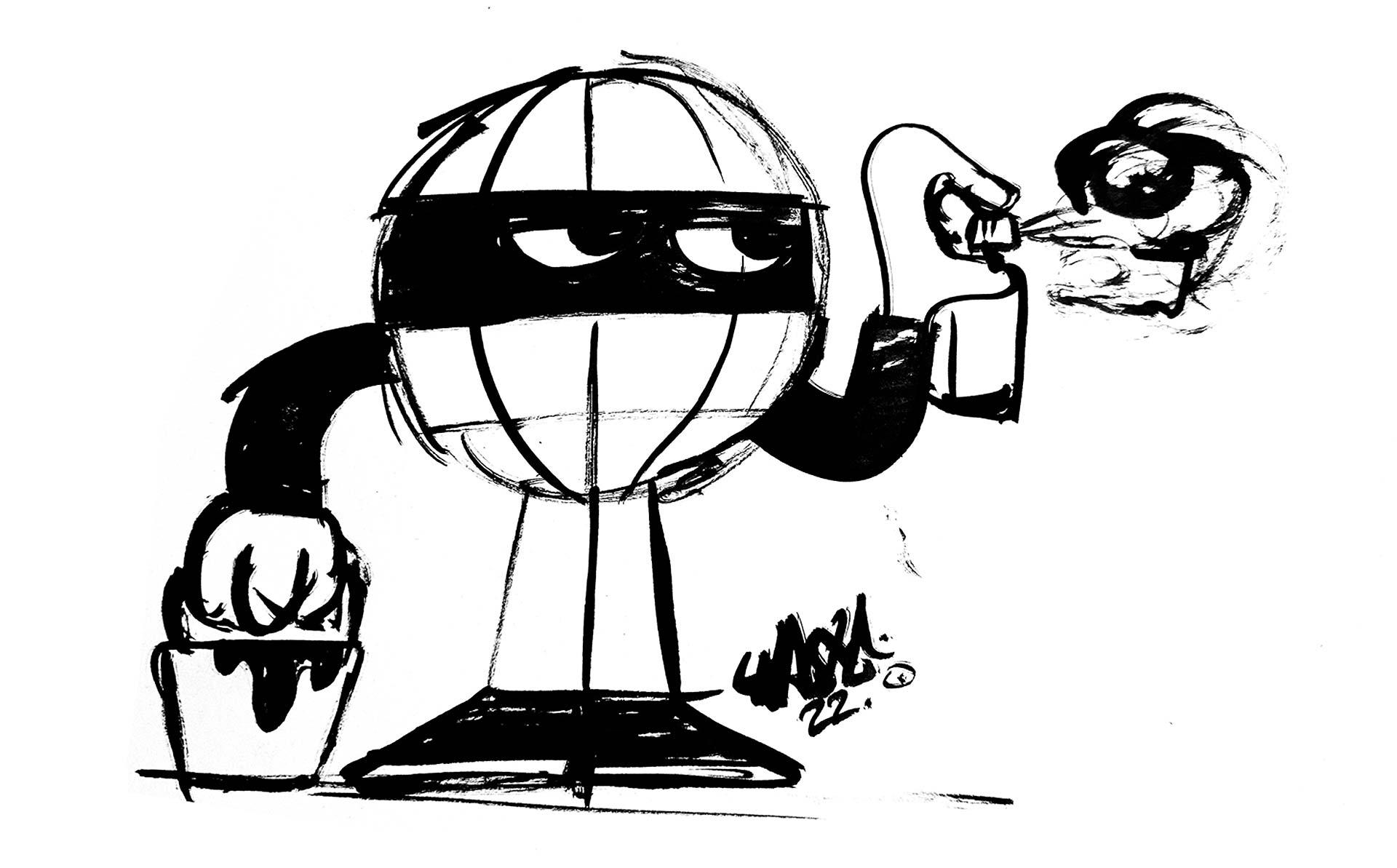
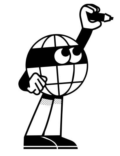
Recently GSA sought out Waste Studio, a multidisciplinary design studio, to partner with and reimagine the agency's visual identity. The goal was to create a look that better mirrored the ethos and personality of GSA – and out of that popped Globey©, a mascot you may have seen peering off of walls and out of alleys in Shoreditch, London, and beyond.
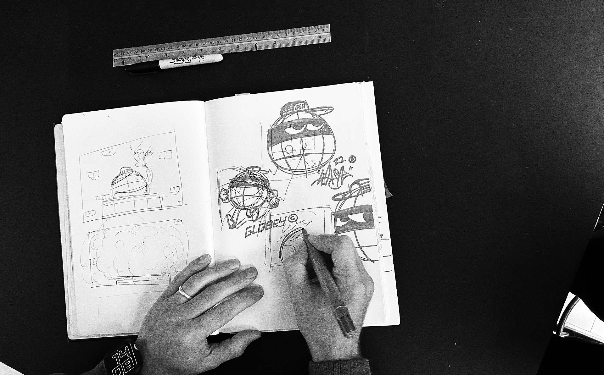
Globey© may be an icon – literally – but with no mouth, it’s difficult for him to speak for himself. We’ve got the next best thing though, with Norm – Creative Director of Waste Studio, the multi-disciplinary studio behind Globey© – and Chris, Head of Design and storied street artist at Global Street Art. Together, they’re the two-headed hydra behind our mouthless marvel.
Below, Ellana speaks with them about the process of bringing Globey© to life.
The following interview has been condensed from its original format.
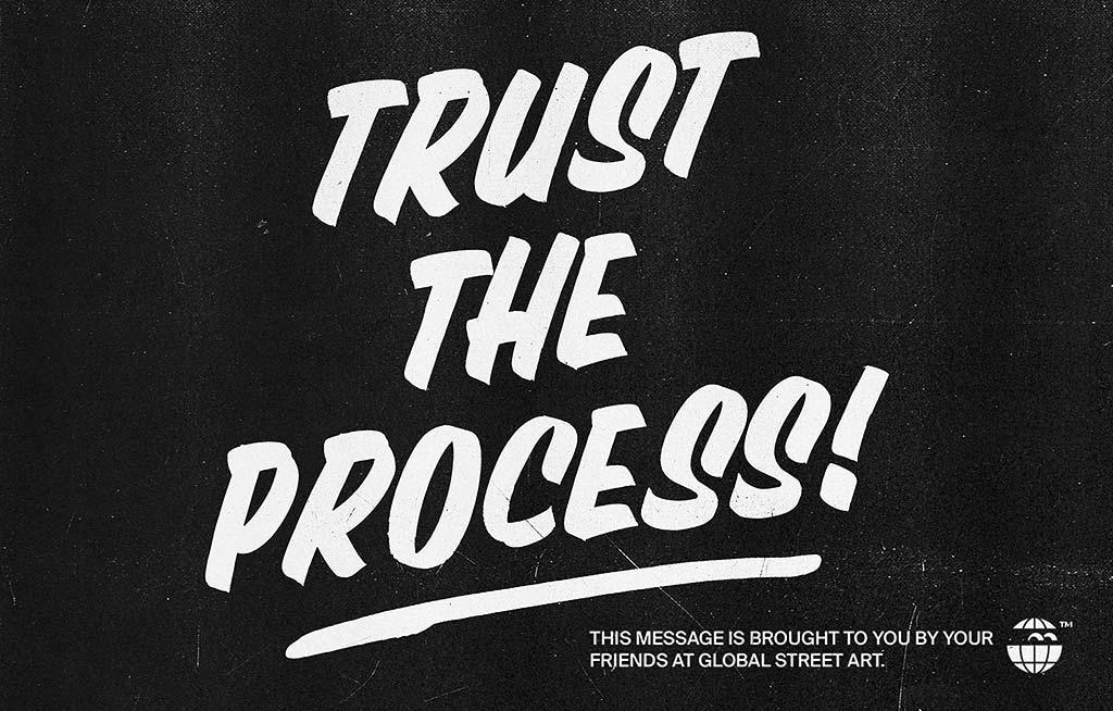
An important public service announcement brought to you by Global Street Art
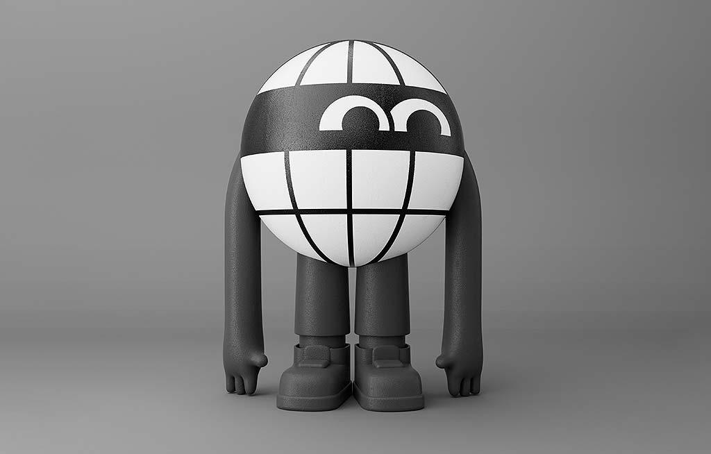
Globey in the third dimension
QN
First of all – everything you say can and will be used against you. All right? Cool. So Globey©. What was the initial spark that inspired you to create a character?
AN
D: It comes from the core of the business: the craft, tradition, hand-painted signage. There’s a whole world of mascots around that. It was important for us that we build the new brand identity around what makes GSA so great, and that is the everyday practise of craftsmanship and the appreciation GSA has for visual culture from the past.
N: After visiting GSA HQ and seeing the vast collection of visual culture held as Ephemera, it was apparent that this is a place that lives and breathes what it practises. As a collector myself, seeing Lee’s vast archive was the catalyst to the direction we took with the brand. We had a lot of discussion around old packaging design, a lot of old American brands, Japanese mascots. With the Ephemera collection at Global Street Art, I saw the collections, all the mascot stuff you’ve got in there – it felt like it worked on multiple levels. Early painting culture, the craft side of it, the collectability and toy side of it… street art has become more mainstream as well – and with it, designer vinyl toys, and the feeling of collectability has also seen a bit of a resurgence.
“It comes from the core of the business: the craft, tradition, hand-painted signage.”
Eyes Mark, 2023, LDN, UK
QN
They say the eyes are the windows to the soul – and with Globey, the eyes in a mask-like black band really make up the entirety of his face. What are you trying to say with that – with reducing a face to such a key component?
AN
N: The eyes for me are the key thing – the black band is the same proportions as a brick, which is generally our canvas. At the core of the brand is this “all eyes on me” mark. The eyes represent GSA’s approach as always on the lookout for the best spots, and the creation of work that catches the eyes of the viewer.
Huckleberry Hound Credit: Copyright Hanna-Barbera
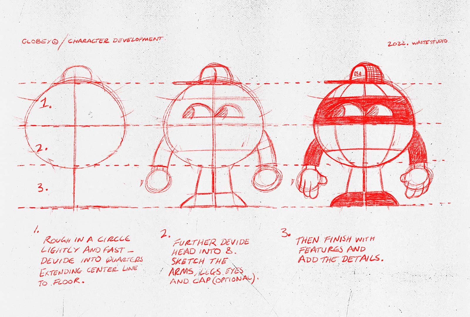
Globey character development - defining proportions
D: We wanted to make Globey© look a little bit mischievous, like in the good ol’ cartoons we watched as a child. This is what inspired the mask. It added so much character without the need to add a nose or mouth.
N: It’s a little bit mischievous, like the classic robber character in old cartoons. But by wrapping it up in a form of a globe, it becomes this kind of loveable character. Originally his eyes were the other way around, which made him a little bit more aggressive and moodier. But we felt he needed a more friendly appearance. What I find fascinating with character design is the power of facial expressions, and how a simple change like flipping the eyes 180 degrees changed Globey’s whole persona.
C: It made all the difference!
N: It literally did! It’s unbelievable.
QN
E: There’s a reference that I see in Globey© – the Kilroy.
AN
N: Yeah, definitely. Kilroy was part of the original inspiration – Kilroy was originally drawn on World War II airplanes as a thing, then adopted by street artists.
QN
E: In a lot of ways Kilroy was a herald of what was to come in the 20th century – popular, repeatable characters that showed up on everything from pencil cases to cereal boxes – but that’s a bit of a bygone era. Why take from the past?
AN
D: Whilst Mascots weren’t as big here in the UK as in the USA and Japan, they had an overwhelming impact on us as children. The products we wanted, but couldn’t get our hands on. I guess this sense of being “out of reach” made them feel even more special.
N: We wanted to create the same aesthetic for GSA. The vision that Globey© can be used across all areas of the brand from advertising to merchandise, giving the brand freedom to play and have fun with this brand asset.
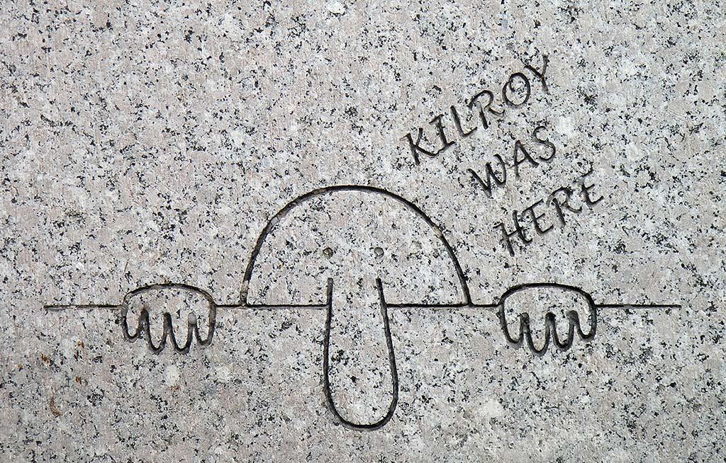
Engraving of Kilroy on the WWII Memorial in Washington, DC. By Luis Rubio from Alexandria, VA, USA - 'Kilroy was here'

Globey Kilroy
C: Yeah, our business is driven by artists and their craft. These old mascots are the face of a brand, someone to trust. It adds that human touch. A bit of heritage.
N: The message is, it’s no different from a…
E: A cereal box.
N: Yeah, a cereal box – like these guys are cool, approachable, have credibility in the space. And can own it.
N: There’s an element of ‘oh that’s cool’, it’s instantly recognizable. You don’t need to write ‘Global Street Art’ everywhere. It’s almost like you’re in the Club. You see it, and you’re like ‘Oh, that’s Global Street Art’.
C: The intentional ambiguity of it ties into street art as a medium. Over the years, I've put thousands of my own stickers up. They don't have a name on or anything, and 99% of people probably just look at it a go 'Oh that's a nice, fun thing', a cool visual. But when you meet someone, and they can discover the backstory – it's a real eureka moment for them, a genuine treat in finding the meaning of something they know, but don't know about. Familiar, but unknown.
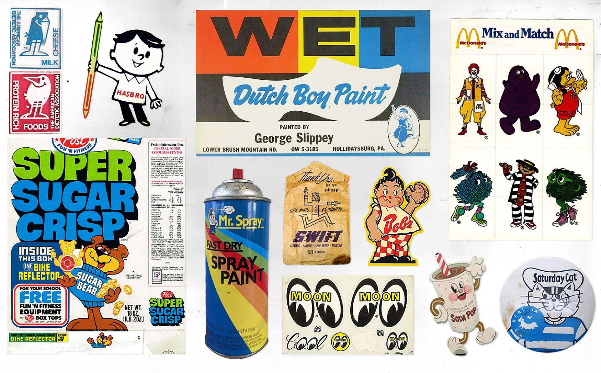
Mood-board of inspiration
QN
E: So we’ve got those two sides then. We’ve got the ‘all eyes on me’ mark eyeballs, the sticker aspect – real-life easter eggs that connect to those street art roots, and then you zoom out – and you’ve got the traditional hand-done art style, the 20th century character-mascot.
AN
N: We aimed to craft a flexible visual identity adaptable to various contexts. I like the idea of the zoom-in zoom-out. That’s a nice thing, isn’t it? Zooming in – all of GSA’s work centres around the eyes—the art itself. And then, zooming out, you grasp the global perspective, viewing it from a distance.
C: As a design tool, it’s got legs – quite literally. A straightforward logo represents the brand, but imagine animating a mascot—there's so much creativity to infuse into the brand. In street cultures, especially in skate culture, there's a hunger for something beyond a static piece of typography. We can diversify without losing consistency; it becomes a fluid part of the visual language rather than a rigid logo mark. A bit more than a static bit of type.
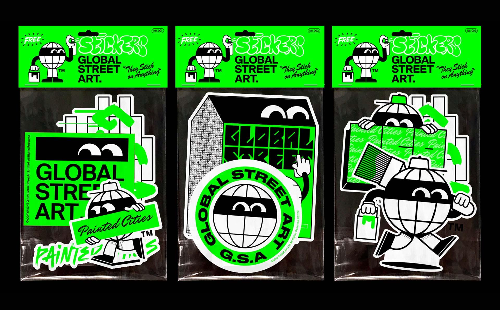
N: We can diversify it. It’s a consistent mark, but it doesn’t have to appear consistently the same way every time. It becomes part of the visual language rather than just a logo mark. The goal was spontaneous recognition, authenticity. Hence, our street mark intentionally omits our name. Instead, we sought an initially anonymous yet cool-looking mark, aiming to cover the streets wherever we go. A silent acknowledgment without the need for shout the 'Global Street Art' name.
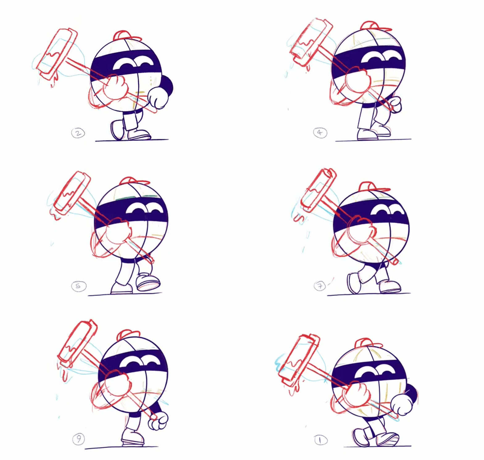
Globey walks to work!
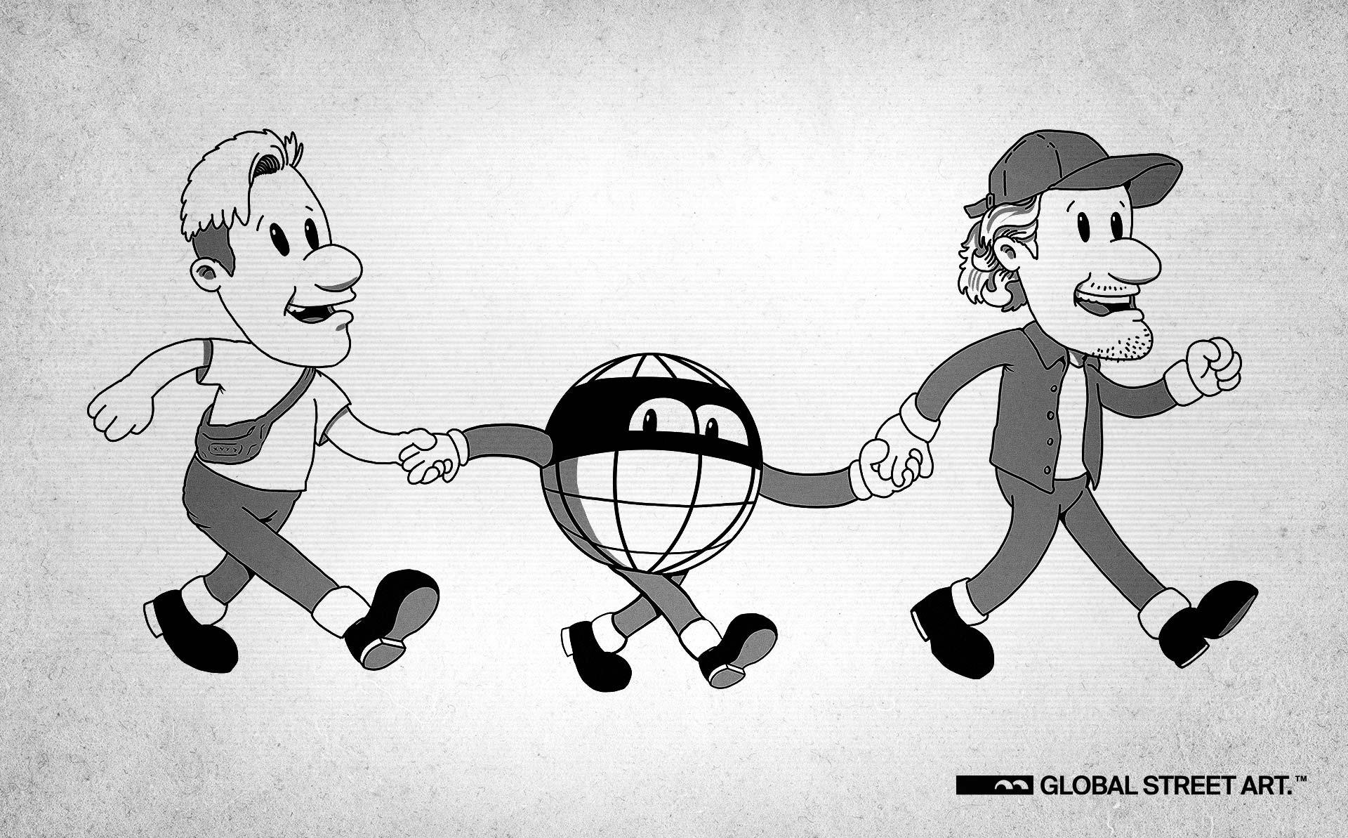
Globey and friends
QN
E: Tell me about Globey on a personal level. What’s his personality? What’s he like? What does he like to do?
AN
C: We have had conversations about this! What would he sound like? Well, I bet he's a fun guy, gets shit done. I guess he would just embody our values at GSA. What do you reckon, Norm?
N: Well, he hasn’t got a mouth, has he? He expresses himself through his art!
